Competitive Positioning Map Examples in Crowded SaaS Categories
Plotting competitors reveals the white space where buyers aren't yet crowded.
There are over 37,000 SaaS products fighting for attention right now. More entrants means more homepages promising "seamless, intuitive, scalable," and at some point those words just stop meaning anything.
Buyers can't tell most SaaS products apart from their marketing copy anyway. So they default to what any tired human does staring down forty nearly identical options: pick the brand they already know, or the one a coworker mentioned in Slack last week. Positioning is the difference between getting picked and never being in the running.
A competitive positioning map won't fix your product. It'll show you where the crowd's standing so you can go stand somewhere else.
What a competitive positioning map actually does and how one gets built
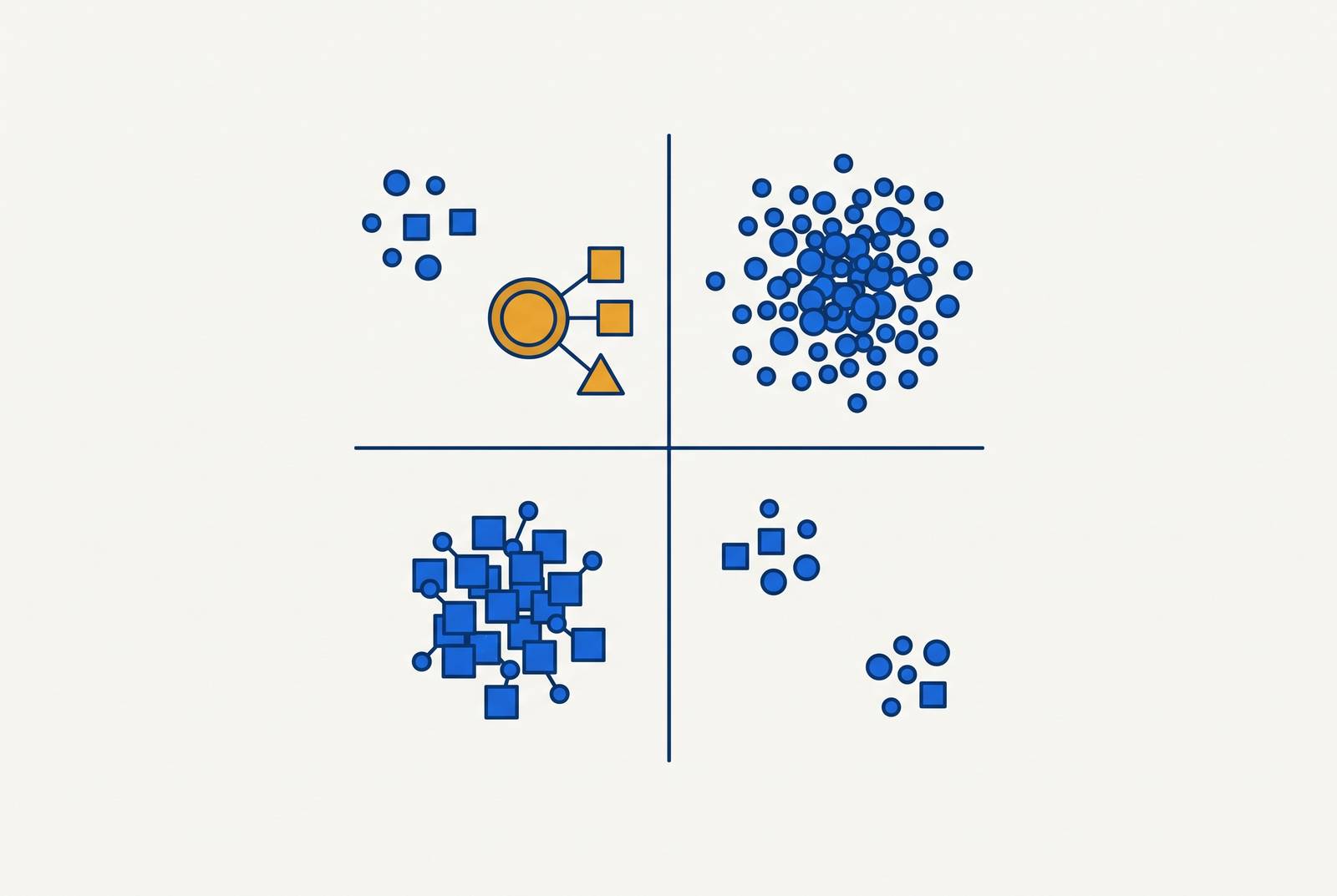
A positioning map is two axes and some dots, and once you plot your competitors, you'll see clusters where everyone's crammed shoulder to shoulder, along with gaps where nobody's bothered showing up. It sounds too simple to matter, which is probably why most founders skip it and go straight to writing homepage copy nobody asked for.
Picking the axes is the actual work here. Pick ones that flatter your product and you've built a map for your ego, not your go-to-market plan. Good axes reflect how buyers actually weigh their options, things like price against feature depth, ease of use against enterprise readiness, self-serve against a sales rep calling five times a week. The goal is to capture whatever buyers already argue about when they're deciding between two tools.
None of this takes a quarter. A decent map comes together in three to ten days: some desk research, a handful of customer calls, maybe a short survey if you've got a list to send it to. G2 and Capterra help sketch the category's edges, and mixing in the big established names with the scrappy new ones keeps the map from tilting lopsided before you've even started.
Category lines are blurrier than people assume, too. Slack shows up in nine separate categories on G2, and its real competition includes Zoom and Google Workspace, not just the obvious rival everyone names first. Map only the competitors you already think about and you'll miss most of the actual pressure on your product.
What you end up with is clusters showing where everyone's piled up, blank spots where nobody's planted a flag, and a few outliers worth a second look. The map shows you the empty space, though whether anyone's standing nearby wanting to buy something there is a separate question that comes later.
How Notion, Superhuman, and Linear found space by refusing category defaults
Find the entrenched default, then walk the opposite direction on purpose. That's basically the whole playbook, and these three companies ran it in three different categories.
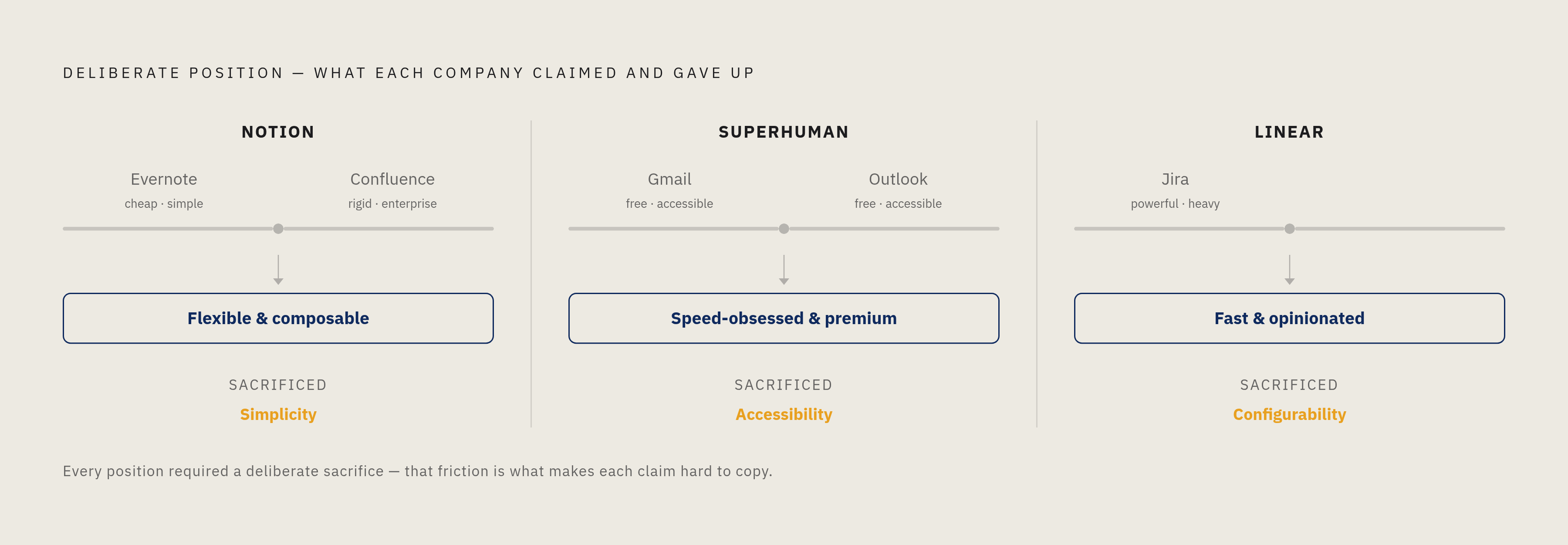
Notion looked at the note-taking map and saw two clusters: cheap and simple (Evernote, Apple Notes) on one side, rigid and enterprise-structured (Confluence) on the other. Instead of squeezing into the middle, Notion claimed "flexible and composable," a position that demands real setup work from users in exchange for a tool that quietly replaces four other tools. That tradeoff built something most SaaS products never manage: an actual fan base. People build templates and trade them around like they're swapping recipes at a potluck. Copy the feature set without copying the obsession, and you'll find out the obsession was the entire point.
Superhuman went the other direction entirely. Email had commoditized hard around "free and accessible," with Gmail and Outlook owning that lane outright. So Superhuman went premium: speed-obsessed, priced well above what anyone expects to pay for an inbox, and deliberately scarce in how it brought users on. Keyboard shortcuts, obsessive attention to milliseconds, the whole product built around convincing people to pay for something they've always gotten free. It shouldn't work, yet it does, because the position manufactured its own reason to exist.
Linear looked at Jira and saw "powerful but heavy," deeply integrated but locked down tight, and went stripped-down instead: fast, opinionated, missing half the configuration options a typical project tool ships with. Engineering teams that build their sprint process inside Linear tend to stay there, not because of a contract, but because rebuilding that workflow somewhere else is a pain nobody volunteers for twice.
Notice what each one gave up. Notion sacrificed simplicity, Superhuman sacrificed accessibility, and Linear sacrificed configurability. That's not incidental. Giving something up is what makes a position hard to copy, because a competitor has to give up the same thing to follow you there, and most competitors won't.
How Gong, Zapier, and Stripe used data and integration depth as positioning coordinates
Price and features are the training-wheels axes, the ones everybody defaults to because they're easy to measure. Some of the sturdiest positions in SaaS live somewhere most maps never think to look.
Gong is the clean example. Sales tools had crowded around CRM integrations and reporting dashboards, a checklist war nobody wins cleanly since everyone can eventually match everyone else's checklist. Gong staked its claim somewhere competitors couldn't shortcut: a massive library of recorded sales calls that sharpens its pattern recognition the longer it runs. You can't ship your way to that position next quarter, no matter how good your engineering team is. The axis that mattered was proprietary data depth, and it's invisible on a standard price-versus-feature grid.
Zapier's version is structural rather than data-driven. Zapier connects over 5,000 apps, and every new integration adds a sliver of value to everyone already on the platform. On a conventional map, Zapier might look mid-tier on price and light on enterprise polish. Add an integration-breadth axis, though, and it's suddenly sitting in territory nobody else can casually walk into.
Then there's Stripe. Deep API integrations, documentation built for developers instead of marketers, switching costs that held up even after competitors matched Stripe on price. Underneath that, transaction data and fraud signals pile up over time and make the product sharper the longer a company sticks around. That flywheel is invisible unless your map has a line for something like "data moat depth," and most maps don't.
The lesson travels past these three names. Whatever axes you pick decide the white space you're even capable of seeing. Build your map only from what buyers spot on a homepage, and you'll miss the positions that turn out nearly impossible to compete against five years down the road.
Why Salesforce and HubSpot's "best in category" position is unavailable to most founders — and what to do instead
Salesforce owns CRM, HubSpot owns inbound marketing, and Zoom owned video conferencing before the category became unavoidable. These are "best in category" positions, earned slowly rather than declared, and they share a trait founders love to skip past: the market decided, over years, on a mountain of third-party proof nobody can fake.
You can't fast-forward that accumulation, and claiming category leadership before the market agrees with you is one of the more expensive ways to learn patience. ICONIQ Growth's 2025 go-to-market research found companies that attempt category design too early spend two to three times more capital than their peers, and still take 12 to 18 months longer to hit the same revenue milestone.
What's actually available to you depends heavily on stage. Somewhere in the early ARR growth stage, the smarter move is competing inside an existing category with a sharper position, or narrowing hard into a sub-segment nobody bothers serving well. Category design as a real strategy doesn't become viable until you're past a significant ARR threshold with the capital to fund a multi-year push, and even then it's a bet, not a guarantee.
So here's what the map is actually good for at the earlier stage: finding the underserved sub-segment the dominant player ignores because it's too small for them to chase. An empty category, by itself, usually isn't the find. A cluster of incumbents all overserving the same big buyer type, though, that tells you something real. Somewhere adjacent, there's a buyer stuck using a product that was never built with them in mind.
Naming that buyer directly, something like "for ops teams at 50 to 500 person companies," tends to land better than a vague claim of category leadership. It's specific enough that the right person feels like the product was built for them instead of marketed at them.
Reading white space correctly — why an empty quadrant on the map isn't always an opportunity
Empty space on a positioning map feels like opportunity, but sometimes it's just an abandoned lot with a nice view.
Before claiming any white space as yours, ask why it's empty. Did someone try this position before, and if so, why aren't they still standing there? Is there an actual segment of buyers who want what this position offers, or just a segment who wouldn't mind it if it happened to show up someday? Those are two very different markets wearing the same outfit.
This is where customer interviews and buyer-language research earn their keep, and it's the part of the three-to-ten-day process everyone's tempted to skip. It's also the expensive one to skip, because job listings, G2 reviews, and support tickets all tell you whether real people describe a real problem in consistent language, or whether you're the only one convinced this gap matters.
Genuine white space sounds like buyers repeating the same complaint, over and over, in roughly the same words. It sounds like workarounds that reveal a need nobody's built for. False white space sounds brilliant in a pitch meeting and registers on nobody's radar out in the real world; it's the quadrant that asks buyers to re-educate themselves about what they even need before they can tell if your product is any good.
The map surfaces candidates, and buyer evidence ranks them. Skip that second step and you'll end up alone in a very quiet, very empty quadrant, wondering why nobody followed you there.
How a founder's public positioning on LinkedIn extends the map into the market
Buyers decide before a salesperson ever gets on the phone. 6sense's 2025 B2B Buyer Report found buyers complete 61% of their decision before reaching out to a vendor at all, and roughly 80% of deals go to whoever was already sitting on the buyer's shortlist day one. The positioning map picks the flag; showing up consistently on LinkedIn as a founder is how that flag gets planted before the sales call ever happens.
Founder content travels further than company content, and it's not close. DSMN8's feed analysis found personal profiles account for roughly 62% of what LinkedIn users actually see, versus about 5% for company pages. Add in Harvard Business Review's 2024 Digital Leadership Study, which found 78% of B2B buyers research company leadership before buying, and 64% say they're more likely to consider a company whose leaders show up online. At that point the math stops being optional.
Founders doing this well skip lines like "we help teams collaborate better," the LinkedIn equivalent of homepage sameness. Instead they name the exact underserved segment, describe that buyer's problem in the buyer's own words, and point at exactly where the category leader falls short. No ad campaign replicates that, mostly because ads don't have a face, a name, or an opinion someone can actually argue with over coffee.
Storylane reports that over 50% of the company's pipeline traces back to LinkedIn, built on sustained presence rather than one lucky viral post. There's a lag worth planning around too, since engagement today tends to turn into closed deals three to six months later, so the positioning work has to start well before pipeline shows up as a problem on someone's spreadsheet.
Specificity is the thread running through all of it. Generic content vanishes into the noise the same way generic homepage copy does. What sticks is content that names the exact buyer, points at the exact gap the market leader leaves open, and owns the exact tradeoff the founder chose. The map tells you where to stand. LinkedIn is just where you say it loud enough for the right person to hear it.